
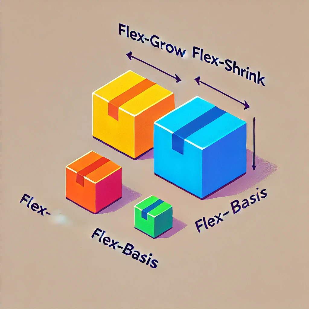
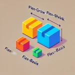
CSS Flexbox is like magic for arranging boxes (or any elements) on your web page. But it’s not always easy to understand, especially when people start throwing words like flex-grow, flex-shrink, and flex-basis at you.
Imagine you’re hosting a party. You have a table (your flex container) and some balloons (your flex items). These balloons are polite—they know how to share space. Some will grow bigger if there’s room, others will shrink if it gets crowded, and all of them start with a certain size. Let’s meet our three party rules:
Rule 1: flex-grow – Balloons Love to Grow 🎈
Imagine you’ve got a big table with extra space. You give each balloon a growth score:
- A score of
1= grows a little. - A score of
2= grows twice as much. - A score of
3= grows three times as much.
Here’s what that looks like in code:
<div style="display: flex; gap: 10px; padding: 10px;">
  <div style="flex: 1; background: lightblue; text-align: center; padding: 20px;">I grow: 1</div>
  <div style="flex: 2; background: lightcoral; text-align: center; padding: 20px;">I grow: 2</div>
  <div style="flex: 3; background: lightgreen; text-align: center; padding: 20px;">I grow: 3</div>
</div>What happens?
The balloons grow based on their scores:
- The first balloon grows a little.
- The second grows twice as much.
- The third grows three times as much.
It’s like sharing leftover cake. Everyone gets a slice, but bigger scores mean bigger pieces 🍰.
Rule 2: flex-shrink – Balloons Know How to Squeeze 🛗
Let’s say there’s extra space on the table 🎈. flex-grow decides how much each balloon will grow Now the table gets smaller. There’s not enough space for everyone. flex-shrink decides which balloons squeeze the most:
- A shrink score of
1= shrinks a bit. - A shrink score of
2= shrinks twice as much. - A shrink score of
3= shrinks three times as much.
Here’s the code:
<div style="display: flex; gap: 10px; padding: 10px;">
  <div style="flex: 1 1 200px; background: lightblue; text-align: center; padding: 20px;">Shrink: 1</div>
  <div style="flex: 1 2 200px; background: lightcoral; text-align: center; padding: 20px;">Shrink: 2</div>
  <div style="flex: 1 3 200px; background: lightgreen; text-align: center; padding: 20px;">Shrink: 3</div>
</div>What happens?
All balloons start at 200px, but:
- The first balloon shrinks a little.
- The second shrinks twice as much.
- The third squeezes in three times as much.
It’s like squishing into a crowded elevator. The polite balloons shrink first so everyone can fit.
Rule 3: flex-basis – Balloons Start with a Size 🎯
Before any growing or shrinking happens, balloons need a starting size. That’s flex-basis.
Imagine telling each balloon: “Start at 100px, 200px, or 300px, okay?”
Here’s what that looks like:
<div style="display: flex; gap: 10px; padding: 10px;">
  <div style="flex-basis: 100px; background: lightblue; text-align: center; padding: 20px;">Start: 100px</div>
  <div style="flex-basis: 200px; background: lightcoral; text-align: center; padding: 20px;">Start: 200px</div>
  <div style="flex-basis: 300px; background: lightgreen; text-align: center; padding: 20px;">Start: 300px</div>
</div>What happens?
- The first balloon starts at 100px.
- The second starts at 200px.
- The third starts at 300px.
It’s like blowing up balloons to a certain size before deciding if they’ll grow or shrink.
Rule 4: Combine Everything with flex
You can combine all three rules—flex-grow, flex-shrink, and flex-basis—into one line using the flex shorthand.
<div style="display: flex; gap: 10px; padding: 10px;">
  <div style="flex: 1 1 100px; background: lightblue; text-align: center; padding: 20px;">
    flex: 1 1 100px
  </div>
  <div style="flex: 2 1 200px; background: lightcoral; text-align: center; padding: 20px;">
    flex: 2 1 200px
  </div>
  <div style="flex: 3 1 300px; background: lightgreen; text-align: center; padding: 20px;">
    flex: 3 1 300px
  </div>
</div>Here’s what this means:
- First balloon: Start at 100px, grow 1x, shrink 1x.
- Second balloon: Start at 200px, grow 2x, shrink 1x.
- Third balloon: Start at 300px, grow 3x, shrink 1x.
It’s like telling the balloons:
“Start here, grow if there’s space, and shrink if it’s crowded.”
🎉 Recap: Flexbox Rules for Balloons
flex-grow= How much cake do you get if there’s extra? 🍰flex-shrink= How much do you squish when it’s tight? 🛗flex-basis= How big do you start? 🎯
By combining these, you can control your layout like a pro. Play with the examples, imagine balloons at a party, and Flexbox will never feel confusing again! 🎈